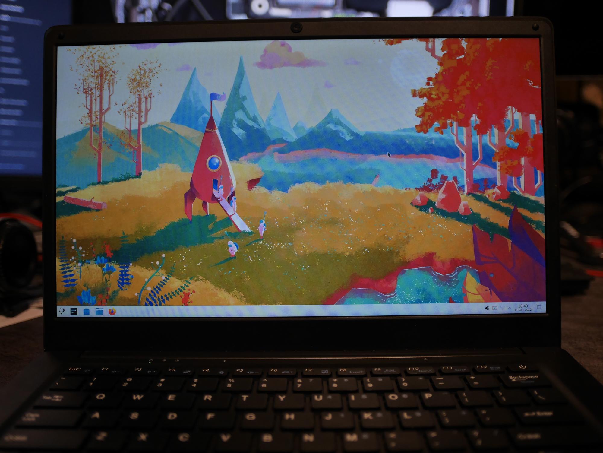
So I'm trying KDE Plasma again, I hear 5.26 has many great improvements and the last time I ran KDE for more than a day was in 2014. I mainly run Gnome and Phosh and Sway on my devices and I feel like I don't use KDE enough for the amount of times I complain about it.
So I decided to put postmarketOS Plasma Desktop on my PineBook Pro. Mainly because one of my issues with KDE has been performance. I know that Gnome runs on the edge of smooth on this hardware so it's easy to compare if KDE will be slower or faster for me there. Testing on faster hardware would only hide performance issues.
Installation
So I installed Plasma with the postmarketOS installer on the Pinebook Pro, I don't have an nvme drive in this device, just running it from the stock 64GB eMMC module.
The only installation issue I had was the disk not resizing on first boot to fill the full eMMMC size, but that's a postmarketOS bug I need to fix, not a KDE issue.
So that continues me writing the rest of this blog post from my Plasma installation :)
First use
My issue with KDE Mostly is that it has many papercuts that I just don't have to deal with in the Gnome ecosystem. I don't want to make this sound like a big hate post on KDE so here's some good things about it first:
- I like how the default theme looks in light and dark mode, I'll probably will swap out the cursor theme since it doesn't really fit but the rest looks nice and consistent
- The notification system is quite an improvement. Gnome has the annoying tendency to pop up the notification right at the place where I'm working: the top center of the screen. If I get a few chat messages I have to manually click a few stacked notifications away unless I want to wait a few minutes for them to time out. The KDE notifications pop up in the bottom right corner and move out of the way, also the visual timeout indicator is great to have.
- I like the set of stock wallpapers in Plasma a lot.
- The default application launcher looks way more polished than I remember. Also I'm always happy when application launchers just pop up when you tap the meta key, which is still not a feature in all desktop environments.
- That lockscreen fade in animation is nice
- The performance has improved quite a lot. I feel like the performance of Plasma on this hardware was absolutely painful a year back when I ran it to get some photos and now it feels quite smooth in mosts places.

Not everything is perfect but I'm quite pleased with how this is running. I know a lot of KDE is about everything being customizable, but the thing I like with Gnome is that it's already setup the way I want out of the box. Well mostly... For some reason on every desktop I install I have to re-add the ctrl+alt+t keybind to open a terminal. If I remember correctly this was a thing in older Ubuntu installations and nobody ships this keybind anymore.
Now for the papercuts I hit in the first hour:
- The application launcher is slow to pop up. Feels like this should just always be there. But I have the feeling that a lot of animations have a half second delay before they start animating.
- The terminal has way too many buttons and toolbars by default, luckily easy to remove again.
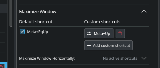
- meta+up doesn't fullscreen the application, it moves it to the upper half of the screen instead. All the other environments I use fullscreen using this keyboard combination.
- partitionmanager doesn't seem to have a function for "extend partition in all the free space after it", instead I have to calculate the new size. Not sure if this counts as an KDE issue or third party applications though :)
- My wifi does not reconnect on reboot for me, but I believe this is a postmarketOS bug.
- The large "peek at desktop" button in the taskbar is pretty useless and way too big for its function. Windows at least made that only 5px wide.
- Performance of Firefox on Plasma seems a bit worse than when running it on Gnome (with wayland)
- The screenshot utility is quite clunky compared to what I'm used to in Gnome. I can only select what to screenshot after the fact it seems. It's quite good as far as screenshot UIs go but not perfect yet.
- The single-click-to-activate in Dolpin, I'd rather double click on items
- Also the active control blue border around the file list in Dolphin. It does not really need to be there and it makes the interface so much more messy. It shows there's focus on the filebrowser widget, but what does that mean? You either have focus on a file in it and that should have the highlight or you don't and then the widget should not have focus.

After some more use
One of the things I had not used yet is Discover, I'm used to installing packages using the command line. I barely use Gnome Software, when I do it's mostly because the flatpak commandline utility is a mess to use. I tried some packagemanagement using Discover and ran into a few pros and cons. This is not only on the KDE side ofcourse because this heavily integrates with postmarketOS specific things.
The main thing I noticed is that Discover is faster than Gnome Software, it's not even close. The speed at which Discover search works makes it actually a realistic option compared to launching a terminal. There's a few paper cuts too ofcourse. If the internet is down and you launch Discover it will show a notification for every repository configured in apk, which is 3 notifications on stock postmarketOS edge.

This notification is almost completely meaningless, It says transferring not what it's transferring and shows no actual progress.
If the internet is up it works pretty smoothly though. The only thing I miss in the rest of the UI is the "Launch" button that's present in Gnome Software to start the software you just installed instead of going through the app launcher.
Customization
Since Plasma is supposedly very customizable, I've been going through the settings to make it work closer to the way I want.
First thing is fixing up some hardware configuration. The touchpad on the Pinebook Pro does not have separate buttons so tap-to-click needs to be enabled, and more importantly, two-finger-tap to right click. The touchpad configuration is nicely set-up in the settings utility in Plasma, this was an easy change to do.
Changing the window management behavior for the meta+up shortcut was also pretty simple, I only was slightly confused by the shortcuts settings a bit because unchecking the checkbox below "Default shortcut" makes it not respond to my custom shortcut. But leaving the default enabled is fine sincec I would never hit meta+PgUp on a laptop keyboard by accident.

Changing up the cursor theme has been proven to be the most annoying. The options for this by default is Breeze and Breeze-light. Which is not what I want, and not what I want in white. This means it's down to the button I always dislike in these environments, the user content browser.
The one in this case is no exception. User content is a huge mess. Names mean nothing, screenshots are mostly useless, it's hard to find some "normal" things beside all the really weird options. Usually the service that hosts the data is also pretty unreliable. After 3 search queries I started to get this error window that immediately reappears when I close it with the button while also showing it has sucessfully fetched the results of the query behind it anyway.

After installing some cursor themes I found that the rendering of anything that's not Breeze is just bad. The preview in the settings window look fine but when I actually apply my configuration the cursor is way smaller. It also only applies when hovering over the window decoration, I still get the old cursor theme on the window itself any any newly launched windows. Deleting the currently active cursor theme also crashes the settings application.
I gave up on this when I remembered that icon themes are standardized. So I installed the adwaita-icon-theme package from Alpine Linux and then I got the option for the adwaita cursor theme. After a reboot the new cursor was consistently applied.
Other customisation things I wanted to try is the general system theming. There's quite a bit of different theming settings available. The first one I messed with is the "Application style"

By default the theme is set to Breeze, I switched it to Fusion because it has actual old school 3D controls like GTK used to have until they decided that custom options are forbidden on libadwaita-enabled applications. Maybe I like this theme because it's closest to old-school clearlooks :)
Changing this theme also fixes the blue border focus weirdness in Dolphin.
For the GTK apps I use there's a seperate settings page.

For GTK there's no preview thumbnails and the settings are very incomplete. With the default Breeze settings the GTK apps integrate more into the general theming of Plasma, with Default it will let the apps use Adwaita. With the Emacs theme... it also just uses Adwaita. The option I'm missing here though is the dark variant of Adwaita. After installing the gnome-themes-extra package I have the Adwaita Dark theme available that I wanted.
I think making GTK look like Breeze is nice from a technical standpoint but by doing that the app will not look like a proper Plasma application, it will just look like it has the same colors and widgets but it will still follow the Gnome HIG, not the Plasma one. Also changing the widget theme to Fusion like I did will not change that for the Breeze GTK theme ofcourse so that introduces more inconsistency. I'd rather have the GTK apps look the way it was intended instead of half-following the Plasma styles.
Finding more workarounds
After some use I have found workarounds for some of my bigger issues. The wifi connection issue can be solved by setting the connection profile to "All users" makes auto-connecting on startup work again.
The annoying widgets I did not want in various places could be removed with the customisation features of Plasma, so not really a workaround but really intended functionality :D
The only large issue I have left is the performance of the application launcher, I'm pretty sure that won't be an easy fix.
Conclusion
I've been running Plasma for a bit now on the Pinebook Pro and I think I will leave it on. It fulfills it's purpose of being the frame around my terminal windows and the browser and hits most of the performance goals I have for this hardware.


