
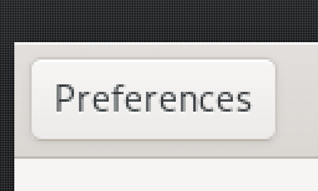
The above picture is a GTK3 button with the Adwaita theme. I like this button. I would even say this is by far my favorite button.
I personally feel like Adwaita has been the pinnacle of Linux design and that the Gnome design guidelines are absolutely great. Apps are laid out in a reasonably consistent way. The purpose of every widget is very clear. The design even works very well on Linux phone formfactors.
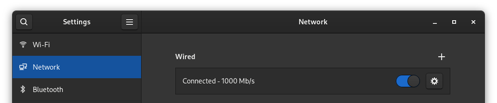
The design for Gnome apps has stayed fairly consistent for at least a decade, there's been some minor design changes over the years which you can easily see by opening Gnome Control Center since it seems to be in a perpetual cycle of moving some panels to a new styling but leaving other ones untouched.

Here is an example of an older panel. Nice boxes with square corners.

This is a newer panel. It uses the ListBox with nice rounded corners. I quite like this design.
I think Gnome has really nailed this design. But in practice I'm using Adwaita dark on most systems. The dark theme, while not officially supported as a normal application theme, works absolutely brilliantly and is a great example of how to design a dark theme.
Everything is still very clear in the dark variant and the general theme of Adwaita has been nicely maintained. It doesn't look like it's just an inverted color scheme for Adwaita or Adwaita with the brightness lowered.
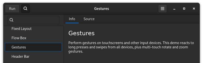
Thanks to Libhandy it's even possible to make nice responsive layouts that scale between desktop use and mobile use without looking out of place. The new widgets introduced with Libhandy neatly fit in with the normal GTK3 theming of widgets. I've been making use of these new widgets a lot when designing applications and I think some of these make desktop design a lot easier and should've been part of GTK3 at the start.
GTK 4
Now GTK3 is the "Old school" way to do UI. GTK4 has been in development for a bit and has improved a lot of the internals. One of the great upsides is that it can take more advantage of the GPU when rendering the UI.
The Adwaita theme has also been nicely carried over and looks very similar to the GTK3 counterpart.

This has all the features I like from GTK 3. The only issue with it is that font rendering looks horrific, but that might just be my machine. Also the dark theme is quite nice.
Libadwaita
So now we're in the other part of my blog post. The things I don't like. When I want to make a gtk4 application for mobile I would need libhandy, but libhandy for gtk4 is not a thing. The "solution" is libadwaita. This provides the widgets I need but it comes with the downside of having some of the worst decisions in application theming.

This is a libadwaita application. With the new libadwaita theming it falls in the pitfalls of modern design. Everything is flat now. Borders on widgets have been eradicated! Blood for the flat design gods!
I personally don't like the flat look. I think Microsoft was stupid for doing it. I think Apple is stupid for doing it and I've been praising Adwaita for being the sane option in an insane world. This is sadly over now.
I don't think removing all borders and gradients counts as design. That's just lazy and completely devoid of having any personality.
My design opinion aside, I think the theme has objective issues as well. This is just a huge decrease in accessibility. The buttons in the headerbar look the same as titles now. The only hint that New List is a button is because it happens to be a split button and has a dropdown icon. It looks identical to the window title otherwise.
For some reason the only button controls in the headerbar with a slight hint of buttoniness are the window controls because they have a background. Ironically these are the only controls in the old theme that didn't look like buttons.
I feel like the designers of this new theme have never sit down with anyone who's not a "techie" to explain to them how to use a computer. While a lot of people now instinctively hunt for labels that have hover effects, for a lot of people who are just not represented in online computer communities because they're just using the computer as a tool this is completely weird. I have had to explain to people tons of times that the random word in the UI somewhere in an application is actually a button they can press to invoke an action.
The dark theme
I've not been able to make the libadwaita apps on my system change theming or even switch to the dark variant, so I'll only have screenshots from around the internet.

In this dark theme the edges and divider in the theme suddenly become light. I find this really jarring and it looks like it's just an inverted theme. This is a minor complaint and otherwise the dark theme is pretty well done except for the flatness issues also present in the light theme.
The community
Now one of the worst parts is that everywhere I only even hint at not completely loving the new libadwaita theme I instantly get shut down and disagreed with before I can even get the chance to give some feedback. Apparently not liking flat themes makes me a madman in this world. Why am I not allowed to even have opinions about the look of the operating system I'm using?
The feedback I get is that I should move to QT/KDE, but I think that theming has had the same issues for way longer already and I do really like the Gnome HIG.
I'm also an application developer, the only choice I have is either staying on developing gtk3/libhandy apps for as long that's supported or start with making libadwaita applications which means I'll be making apps that I don't like the look of, which is incredibly depressing.
Gnome activists have already been doing the whole "Don't theme my app" thing, why are they theming my app now? this goes both ways!