
I started my day checking the headlines on news sites and saw an interesting title that caught my eye because it's about CSS. These posts are generally interesting because it'll mean I learn some new CSS tricks.
The posts I've read are https://dbushell.com/2026/07/03/fixing-full-bleed-css/ and since this refers to https://www.joshwcomeau.com/css/full-bleed/ I've read that too. And the only thing I think while reading is... why are you making this so complicated.
But still you should read those posts but I also learned some new tricks.
The holy grail layout
First the holy grail layout. This was very annoying to get right in the era where you'd have to use divs and floats or you just weren't a cool web developer. But before that it was it was super easy to make work with a table.
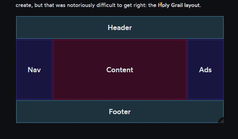
Just looking at this makes it very obvious how you'd describe this as a table:
<table>
  <tr><td bgcolor="cyan" colspan="3">HEADER</td></tr>
  <tr>
    <td bgcolor="blue" width="100">LEFT</td>
    <td bgcolor="red">CONTENT</td>
    <td bgcolor="blue" width="100">RIGHT</td>
  </tr>
  <tr><td bgcolor="cyan" colspan="3">FOOTER</td></tr>
</table>
That's almost all it takes. To make this take up the entire screen you just need this css to set the size and remove the default padding from the default DOM elements:
body, html { padding: 0; margin: 0; height: 100%; }
table { width: 100%; min-height: 100%; }
I can already hear you complaining that you shouldn't use tables for layout. Why exactly? A lot of modern CSS features seem to be added to do this exact thing again without having to use a table element, and by moving all the table metadata into CSS where there's no good natural syntax to describe such things.
If you really don't want to use the table element for this you can always use div or whatever element you like and then make them behave like table elements using display: table-cell etc in your stylesheet.
This layout is not super popular anymore for websites though because a menu sidebar is just oldschool and doesn't fit nice on mobile. And ads? in the sidebar? that's weird... put them in the middle of the content instead! And with that we're back to the old school flow layout.
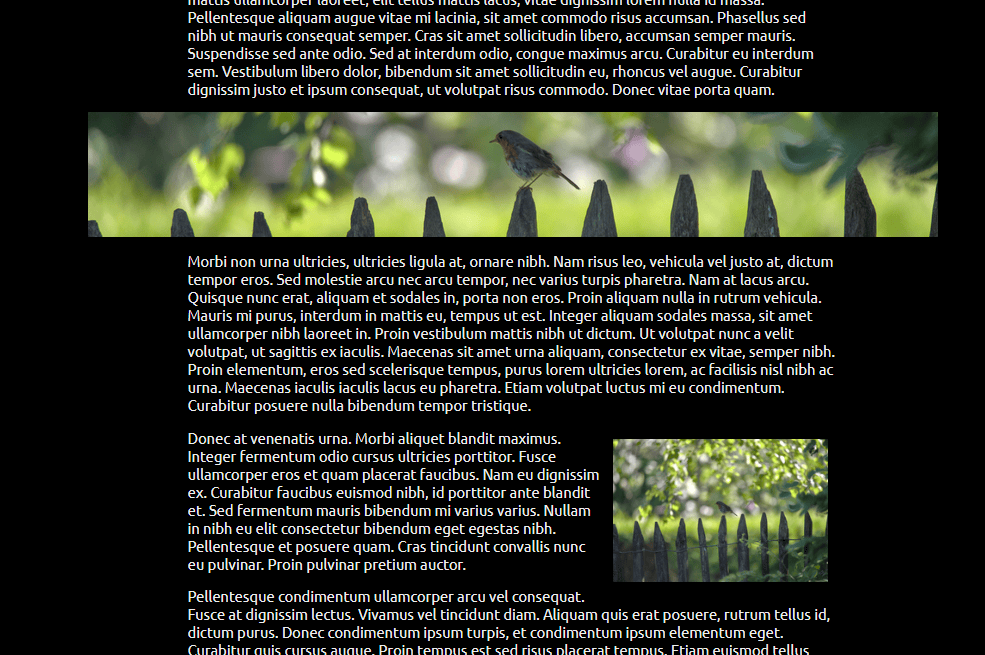
Full bleed CSS
I like this layout. This blog post even uses it to render content (although I didn't write the html/css for this, it came with the theme).
This basically means just rendering your content in a column in the center, but allowing images to be wider. Here as an example is an image that's very wide but limited by the content width:

I can set this image to take all the width it needs with a toggle in the editor, and it'll render wider than this text column if you're not on mobile. If your monitor is not too large it might even go to the edge of the screen.

I don't generally have images set up to go to the edge of the screen for true "full bleed" since it turns out people have massive monitors and that just makes your website unreadable.
So I've seen many ways to do this, I've learned two more from the two blog posts I read today. But there's a very obvious simpler way that everyone seems to ignore in favor of brand new CSS features:
p, h1, h2, h3, h4, h5, h6, img {
  margin-left: auto;
  margin-right: auto;
  display: block;
  max-width: 650px;
}

img.extracool {
  max-width: 850px;
}

img.ultracool {
  max-width: 100%;
}
This works perfectly everywhere and doesn't care at all what layout mechanisms you use around it to layout your header and footer. You can define the maximum width you want every element to have and are not limited to arbitrary grid lines you have placed beforehand. It's almost like this is the main usecase for CSS on pages. This snippet is just CSS 2 from 1997!
As a bonus here's also a float: right used in the intended way.
Drop down menus
One of the things that is actually hard and I don't see becoming easier even though it's so widespread: drop down menus.
I know I'm designing a site soon that uses it and I already dread building that part again. Maybe I figure out a simple way for it soon.